In What ways does our Media product use, develop or challenge forms and conventions of real media products?
Final Trailer Project Video
|
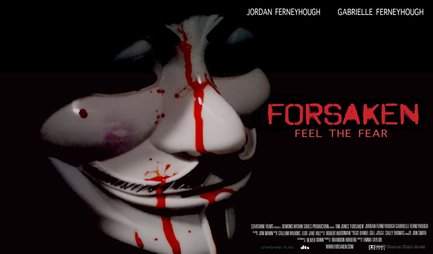
Final Poster for Trailer Project
|
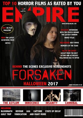
Final Magazine Cover for Trailer Project
|

|
|
Evaluation Question 1 Video
Using Conventions (Trailer)
When developing and filming our Trailer project we decided to use some conventions that come with making media products. Conventions are the tropes that most Horror media makes use of, however conventions in media are still used because they are tried and tested to be useful and very effective when trying to make a successful media product. Some of the conventions we used in our Trailer project was,
- Female Victim- During our trailer we featured a primary victim who just happened to be a female. Female victims are a typical Horror media convention/trope as females are generally portrayed to be weaker and thus be more suitable for the role of a victim of a Horror themed film than a male would.
- Masked Killer- During our trailer we featured a killer who throughout the entire trailer remained masked in order to hide their identity. This is a typical Horror media convention/trope because masking the killer keeps his or her identity a secret leaving room for a potential twist later on the real identity of the killer.
- Pacing of editing to build tension or provide impact- During our trailer we have some parts where the shots speed up to be very fast paced with very quick cuts. Editing techniques like this where there are very quick cuts or very long drawn out ones are conventions/tropes in Horror related media, specifically trailers to help build the atmosphere and tension needed for a successful Horror film title.
- Dark filming locations for low-key lighting- During our trailer we used several times throughout, very dark and shadowy areas for filming. Dark areas help to provide atmosphere and tension in a Horror film. This in a typical convention/trope in Horror related media as it helps obscure the threat from view and make it seem like the character can get jumped from anywhere, providing that Horror based tension.
Challenging Conventions (Trailer)
When developing and filming our Trailer project we decided to go against some conventions that usually come with making Horror based media products. (Conventions are the tropes that most Horror media makes use of, however conventions in media are still used because they are tried and tested to be useful and very effective when trying to make a successful media product). Some of the conventions we went against or challenged were,
- The Final Victim- During our trailer we featured a few different individuals who were victim of the killer or attacked by the killer. This goes against the normal Horror film convention where the killer will specifically hunt a single individual usually known as 'The Final Victim' or in most cases 'The Final Girl' due to the convention of female victims.
- Male Victims- During our trailer we featured different victims and people who are attacked by the killer throughout. As the trailer goes on we do see male victims which goes against the standard Horror media convention of the 'weak' female role being hunted or attacked by the killer and as males are not usually seen as victims in Horror due to the stereotype of men being strong and being able to fight back.
Using Conventions (Poster)
When developing and making our poster for the trailer project we had worked on we decided to utilise some of the typical conventions used in making Horror themed theatrical posters. (Conventions are the tropes that most Horror media makes use of, however conventions in media are still used because they are tried and tested to be useful and very effective when trying to make a successful media product). Some of the conventions we followed were,
- Colouring Based Connotations- During the making of our poster we decided to use colourisation to help portray from just looking at the poster that is was advertising a Horror themed film. We featured the colour red prominently on our poster representing and portraying blood in the image. The title of the film is also of the colour red with the font looking like a blood splatter, straight away giving the connotations of blood, injury and death usually associated with Horror themed media.
- Use of Universal Font- During the making of our poster we decided to use the Universal font for the creditation of several people involved in the trailer project that was position in the bottom right corner of the poster. The Universal font is the standard font used for crediting people on a poster, we decided to stick with this font as it looked neats and more professional than other font we found.
Challenging Conventions (Poster)
When developing and making our poster for the trailer project we had worked on we decided to go against some of the typical conventions used in making Horror themed theatrical posters. (Conventions are the tropes that most Horror media makes use of, however conventions in media are still used because they are tried and tested to be useful and very effective when trying to make a successful media product). Some of the conventions we went against were,
- Font used for the Title- During the making of our poster for the trailer project we had worked on we decided that instead of using typical fonts used for theatrical posters, we decided to stick to the same we used for the trailer. This was ultimately chosen to make the poster fit the Horror theme more due to the font already chosen as well as for it to contrast the background we had selected for the poster.
- Colour Scheme- During the making of our poster for the trailer project we decided to go against the typical colour scheme that many Horror film theatrical posters seem to be making use of these days which makes heavy use of black and white. A lot of Horror related posters make use of this black and white scheme heavily, even making the blood look very dark, almost black to contrast the background of the poster. Our own poster while featuring a black background with a white mask, it doesn't remain completely black and white and still has very saturated reds for the portrayal of the blood and with other smaller colour tones on the mask providing more definition to it.
Using Conventions (Magazine Cover)
When developing and making our magazine for the trailer project we had worked on we decided to utilise some of the typical conventions used in making Horror themed magazine covers. (Conventions are the tropes that most Horror media makes use of, however conventions in media are still used because they are tried and tested to be useful and very effective when trying to make a successful media product). Some of the conventions we went against were,
- Layout- The typical layout of our magazine cover is very similar to the actual Empire magazine layout. The Mast Head, Skyline, Slogan and other are all in the typical magazine cover locations standardised by both the Empire brand and traditional film magazine covers. The layout was chosen to adhere to the professionalism of standard magazine covers used in the industry today, we followed this standard layout so our magazine didn't look amateur in comparison to the competition.
- Advertisement Reel- Some industry examples of magazine covers feature a small section of the cover where it shows images of what other films will be featured in its content. Our magazine cover like many other examples features a small section of the overall cover to show off other films that would be featured in the actual product, we placed this below the main image and the Anchorage Text and it features 4 different movie titles all with images from their respective trailers.
Challenging Conventions (Magazine Cover)
When developing and making our magazine for the trailer project we had worked on we decided to go against some of the typical conventions used in making Horror themed magazine covers. (Conventions are the tropes that most Horror media makes use of, however conventions in media are still used because they are tried and tested to be useful and very effective when trying to make a successful media product). Some of the conventions we went against were,
- Main Image- Usually Horror magazine covers pertaining to the Slasher sub-genre only include the killer on the cover of the magazine cover. On our own magazine cover we decided to include both the killer and one of the victims on the Main Image, this made the Main image look more unique than the tradition Horror Slasher sub genre magazine cover which should attract the reader to our magazine as it would make our product look different than the rest of of the magazine products on offer.
- Lack of Gore- Most Horror themed magazine covers feature more gore like imagery to relate to the theme of the content that their product will have. On our own magazine cover we have not featured much in the name of gore at all. We made this decision because we thought the introduction of gore like elements would make the design look cluttered. We also decided not to include any gore like elements as it could attract Horror watchers and readers who are not fan if excessive gore.
Inspirations from real life media products (Trailer)
When developing and making our Trailer project we took inspiration from other real examples of trailers used in the industry today. While developing our Trailer project we were largely inspired by the Trailer of, Friday the 13th remake theatrical trailer by Michael Bay. During the second half of the trailer of Friday the 13th the style of shots and general editing inspired us to try and match the quick shots shown in this second half. In our trailer, our own second half is made up of fast moving and quick shots similar to this Friday the 13th trailer to increase the pace of the trailer and provide that tension it needed. Friday the 13th's trailer involves the killer chasing down his victims to kill them once the trailer began to ramp up and get going to the more action orientated sequences. This inspired us to structure our scenes in the second half as a montage like sequence shown in the second half. Another trailer we were inspired from was the Halloween 2 2009 theatrical trailer. In the Halloween 2 (2009) trailer the killer Michael Myers goes after several victims during the trailer. Michael Myers actions in this trailer inspired the actions of our own killer within our trailer project as our killer goes after and attacks several victims as well as being able to seemingly travel around to many places without being caught. The trait of travelling around came from the way Michael Myers is seemingly able to attack people in a variety of areas within the trailer, this creates more tension as the killer can appear anywhere. For individual scenes we took some inspiration from other theatrical film trailers that we could find. Some trailers we took inspiration from both Friday the 13th and even Nightmare on Elm Street 2010.
|
|
|
|
Inspirations from real life media products (Poster)
|
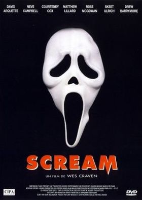
When developing and making our Poster for our Trailer project we took inspiration from other real examples of posters used in the industry today. One of the theatrical posters we took inspiration from was the original Scream. The original Scream poster featured primarily the killers mask as the focus against a black background in direct contrast with the white mask, keeping the poster eye-catching to the viewer. The title for the poster is very fitting with the theme being block, sharp and blood red in direct relation with the genre of slasher and the killers signature weapon being a knife. The Scream poster has a very clear scheme of colour and has a central focus, creating a clear brand identity for the film with an iconic image. In our own poster for our trailer project we decided to follow the same sort of style due to the genre and concept of the film being very similar to Wes Craven's Scream. In our own poster we used our own killers mask as the main brand identity of our poster and project in general similarly to the Scream poster. Also inspired from the Scream poster was using the red text title. In our trailer project we already had our title in red with a font that had a blood splat aesthetic. We decided to port this over to our poster as it was to make it stand out as the title against the complete black background as well as being appropriate theming for our poster. Overall our poster took a lot of inspiration from the theatrical poster for Scream from similar colour scheme to a similar concept of brand identity.
|
|
Inspirations from real life media products (Magazine Cover)

|
When developing and making our magazine cover for our Trailer project we took inspiration from other real industry examples of magazine covers. With our magazine cover we took inspiration from the magazine Empire. Empire is a film based magazine that covers all sorts of upcoming films in each issue. The cover of the Empire magazines usually feature a big main image in the centre with the titles and text surrounding the main image. Some Empire magazines feature a small reel like section towards the lower half of the cover feature screenshots of other films to be featured in the magazine issue.
When it comes to our own magazine cover and our inspiration from the Empire series, we were initially inspired through layout. Our own layout very similarly mirrors the traditional Empire magazine layout from our Main Image to the titles and information scattered around the image. Our mast head for the magazine cover also has a subheading or Skyline above as well as the price and issue details between the titles lettering. We use the same font choice for the main title of the magazine cover to keep our design looking authentic and professional. While our magazine cover does differ from the actual Empire magazine a little, the core idea and inspiration still shines through in our design. |
|
|
This is an interactive presentation detailing the structure of a magazine cover. This presentation shows the structure of the typical magazine cover in relation to our own and details exactly what each section of the structure is designed to do for the cover itself to make it effective.
|
