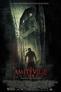
'The Amityville Horror' film's theatrical poster features a very simple and effective title that explains the premise of the movie. The Amityville hauntings are a very famous story and the likelihood of the target demographic knowing of this story is high.
The text on the poster features a very simple but professional font that is appropriately colourised to give the fearful connotations the poster is trying to portray. The text has the Y letter in the middle continue to drip down trough the entire title as if it was a blood trail dripping down the wall, continuing the fearful connotations. |
The text used in the trailer itself is a much more simple and easy to read block white font. While the font on the poster looks more professional for the type of media that it is, the font of the trailer still looks decent that still gives off the more fearful connotations due to the styling of the lettering and how the edges are not very well defined.
|
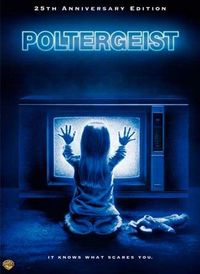
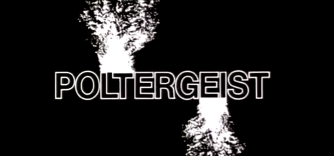
The theatrical poster for the film 'Poltergeist'. 'Poltergeist's' simple title easily conveys the main premise of the film from the moment of reading. The actual font itself is a very simple block lettering that is giving off a faint glow. The faint glow meshes well with the imaging of the television which becomes central to the plot of the film.
The faint blue glow coming from the lettering gives the connotations of mystery and suspense as it engulfs most of the poster against the black background. 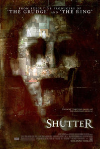
The theatrical poster for the film 'Shutter' depicts a very dark atmosphere, this is also reflected in the text on the poster.
The text has a very simple and stylised font that is very curved and gives off a small faint white glow against the dimly lit green/black tinted background. The white glow gives the connotations of innocence and freedom against the very grim tones portrayed by the rest of the poster. The faint glow also gives the connotations of mysteriousness. |
The lettering used in the trailer itself is a much more simple and white outlined font against a black background. The text here does not look as effective as the text on the poster, nor does it give off the connotations that the text on the poster does.
The text used in the trailer itself for the film 'Shutter' very much replicates that seen on the poster, however a key difference in the font is that the trailer features a more block-like font, presumably so the text is easier to read. Due to the similarities in the text from colouring to the glow, the connotations given are similar to the exact same.
|
