When making a Horror related media, it is important for the font to be appropriate. The font can help build the atmosphere surrounding your trailer and if good enough can even be part of the brand identity for the product. Font choices in a media product for this reason is very important, especially in a Horror film. If in a Horror trailer you have very good atmospheric shots as well as good editing, acting and casting and then pair it with unsuitable font, the atmosphere and tension the viewer will feel will instantly disappear and their immersion into the piece will be broken.
|
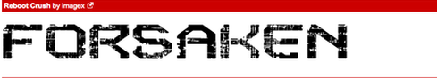
This font 'Reboot Crush' is not a suitable font for a Horror film. The design and aesthetic of the font looks too much like a Sci-Fi genre font rather than Horror. 'Reboot Crush' does not at all give the connotations of a dark and grungy Horror but instead a high tech Sci-Fi environment due to the patterns on the letters and the design of the font itself.
|
|
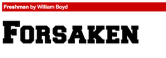
This font 'Freshman' does not suit a Horror film. The design of the font itself is too blocky and cartoonish and does not give the appropriate connotations towards the viewer about Horror. The font looks like it should be in a more family friendly film for either all ages or teens rather than a Horror.
|
|
|
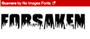
This font 'Guevara' is more suitable towards the Horror genre than the previous two choices. This font looks like it would be in a old style Slasher from the 80's if it was coloured red. The type of block design in this font is similar to the types used in the older types of Slasher films from that era.
|
|
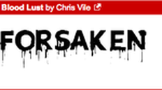
This font choice 'Blood Lust' is suitable for a Horror genre film. The more rough and less defined edges along with the dripping of blood from the text itself gives the viewer the connotations of blood, gore and death, something the other font choices completely lacked.
|
|
Industry Examples (Trailers)
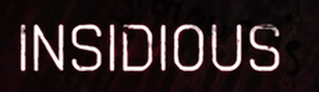
This is the font chosen for the title of the theatrical trailer Insidious. This font choice is appropriate for a Supernatural Horror because the font is coloured white rather than red. The white gives the connotations of the unknown while also safety and innocence. This is contrasted by the dark patches on the text which could represent corruption of the innocence or symbolise the possession of the child in the film.
|
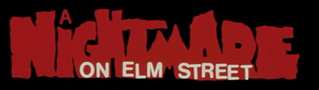
This is the font chosen for the title of the theatrical trailer Nightmare on Elm Street. This font is suitable for a Slasher Horror because the font is coloured and designed to look like pools of blood which are shaped like the title text. The blood part of the title only affects the 'Nightmare' portion of the title, representing the killer taking action in people's dreams.
|
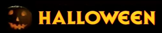
This is the font chosen for the title of the theatrical trailer Halloween. This font is suitable for a Slasher Horror because of the time it represents. The Halloween films take place during Halloween. The colouring is the same as the candle light coming from the pumpkin in the picture. The font itself is also bold and easy to read similar to Slasher font of the time.
|
Our Trailer Title Font Choice and Justifications
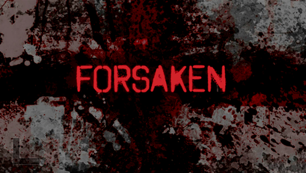
Our own trailer was of the Slasher Horror genre. In our trailer the font choice we had chosen was 'Octin Spray-Paint'. This font choice is suitable for our trailer and its genre because the font is easy to read but also fits the theme of a Slasher Horror as well as gives the connotations of death, gore and blood as a Slasher Horror normally would. The red colouring of our font choice along with the spray-paint aesthetic combine together to form a font that looks like splats of blood that spell out the trailers title 'Forsaken'. The saturation of the red in the 'Forsaken' title helps to define the title and make it stand out from the background. The background helps bring the text to the forefront while also adding towards the atmosphere and connotations that the title and its font are trying to portray. This font choice is in a 2D style rather than 3D because a lot of 3D font choices look too cartoon like or too blocky and they don't have a lot of good designs that can help sell the connotations you are looking to try and sell with the font choice.
We decided that for the titles, we used a red background with black text for all of the onscreen text. The red background symbolises that there is blood involved and it can also signifies danger. All of the text is in capital letters,as it shows that some of the information given may be important. An example of this is the production company.
This can help the production company to be more recognisable and noticeable within the trailer. The red and black combination is great for horror, and the transitions for the text to appear on the screen is just a fade. This is a better option than having large 3D action like font as it does not suit with the horror genre. As the text shows on the screen, you will see images of skulls flashing around in the background. This can symbolise death and corpses within the trailer. This was done as it adds to the red background with the black text, otherwise it can look blank as there is not a lot happening on screen for that amount of time.
This can help the production company to be more recognisable and noticeable within the trailer. The red and black combination is great for horror, and the transitions for the text to appear on the screen is just a fade. This is a better option than having large 3D action like font as it does not suit with the horror genre. As the text shows on the screen, you will see images of skulls flashing around in the background. This can symbolise death and corpses within the trailer. This was done as it adds to the red background with the black text, otherwise it can look blank as there is not a lot happening on screen for that amount of time.
Industry Examples Posters
|
|
|
Our Magazine and Poster Font Choice and Justifications
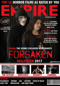
On the magazine cover features the same font as the trailer and for the same reasons. The Font was kept the exact same as the trailer on the magazine cover as to co-inside with the brand identity we were setting up with our three main products. On the magazine cover the font colour contrasts against the very dark background and helps to make the cover itself look eye-catching to the reader. The colour of the font also fits the style we were going for with the magazine cover with the first word of each paragraph/sentence being coloured red.
|
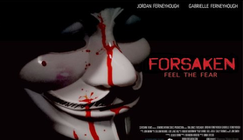
On our poster for our trailer project we again used the same font choice for the same reasons as the trailer and magazine cover. The font choice was kept the same as to keep in line with the brand identity we were trying to set up with our three main products. Here the font contrasts the black background making it very eye-catching and a focus of the poster besides the image The colour also works with the blood featured on the mask main image of the poster.
|
