Before making our own movie magazine, we must first research other magazines on theatrical released and successful horror films. In doing this we will take inspiration and use some of their techniques to make our own movie poster for the film trailer we have created.
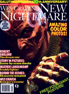
This is a Nightmare on Elm Street magazine cover. This particular magazine seems to not be a big brand like Empire or ODEON and instead seems to more of a general film or television magazine. The image on the magazine cover has the main killer, Freddy Krueger on the cover with his iconic clawed glove, the brand identity of Nightmare on Elm Street. Freddy is seen in a very dark image where most of his body and part of his face in concealed in darkness. The parts of Freddy that can be seen are very visible and the lighting really brings out the many features and intricate details on the costume and make-up of Freddy's actor. This helps to make Freddy look a lot more intimidating and convey to consumers that the film on the cover is a Horror film. The text used on this magazine cover has a very 80s-90s like quality to it which references the time when the Nightmare on Elm Street franchise was made.
What primarily makes this magazine cover successful is the very striking and iconic image associated with the Nightmare on Elm Street brand.
What primarily makes this magazine cover successful is the very striking and iconic image associated with the Nightmare on Elm Street brand.
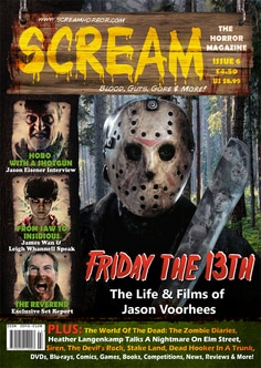
This magazine cover by the 'Scream' corporation features Friday the 13th as the main image for the magazine cover. Another thing featured on this particular magazine cover is a small section of the cover that shows other films that the magazine covers in its content. The image of Jason Vorhees from Friday the 13th makes use of the franchise's iconic image, that being Jason's hockey mask. The mask itself is not very clean and looks rather old and used, this gives off the connotations that the person on the cover is a killer.
Within the image Jason can be seen clutching a machete, this helps to show the customer that the magazine is Horror film related. The titles featured on this magazine have text like, 'Blood, Guts, Gore & More'. This helps further convey to the customer that the magazine is of a Horror based theme.
Within the image Jason can be seen clutching a machete, this helps to show the customer that the magazine is Horror film related. The titles featured on this magazine have text like, 'Blood, Guts, Gore & More'. This helps further convey to the customer that the magazine is of a Horror based theme.
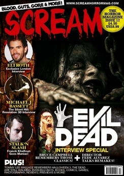
This is another 'Scream' magazine example where the main image on the cover of the magazine features a scene from the 'Evil Dead'. As with the previous example the side of the magazine cover advertises the other Horror based content within the magazine.
The name of the magazine is 'Scream' and it is seen at the top of the cover in a big red bloody font to symbolise the fact this is a Horror based magazine.
The lighting of the image is very low-key and helps top conceal the character from the Evil Dead in the image in darkness. The darkness from the low-key lighting keeps what is happening mysterious but also iconic to the Evil Dead franchise.
Components of a Magazine Cover
Skyline
The line at the very top of the magazine cover, its purpose is to attract the reader and inform them of the potential content or what the magazine is about.
The line at the very top of the magazine cover, its purpose is to attract the reader and inform them of the potential content or what the magazine is about.
|
Mast Head
The Mast Head refers to the large brand title on the front of a magazine cover that is very big so the reader can easily read it. Usually the Main Image overlaps the Mast Head. Main Image
The main image is the vocal point of the magazine cover that grabs the readers attention before they even pick it up. It should relate to the content inside while also advertising said content. Direct Address
The Direct Address refers to the effect the photo is trying to achieve. This photo is trying to convey power and professionalism towards the reader. Layout
The layout of this magazine is quite a formal layout. The Anchorage Text is big and professional while also fitting into the colour scheme and the layout of the text helps to make the Main Image more powerful. |
Sell lines
Sell Lines are designed to attract the target audience. The Sell Lines are put in place alongside the text and help give away information to the customers, attracting them to buy the magazine. |
Slogan
The Slogan is actually the Skyline. The purpose of the Slogan is to give information to the reader enough to where they would be drawn in to read the magazine. Bar Code
The Bar Code is usually left to the side of the magazine cover as it doesn't not directly link in with the content but it is important to have on the product itself. Colour Scheme
The colour scheme is very simple using a black/blue hue in combination with a white light to make the bold red text stand out more to the reader. Anchorage Text
The Anchorage Text refers to the text that overlays across the Main Image. The Anchorage text is meant to tell a little information about the content in the magazine cover. |
